

Welcome to my think tank! I'm Michelle Pao [/pou/]. I am a sophomore majoring in biomedical engineering and minoring in graphic design at Binghamton University. My future career aspiration is to be a UI/UX designer while being a freelance graphic designer.
Bullet journaling and hand lettering are just some ways I like to get my creative juices flowing. If I'm not creating, you can catch me ordering pink drinks one after another at Starbucks or thinking of ways to expand my portfolio. I am hoping to sell enamel pins soon, so keep your eye out for some swag for your jean jackets, backpacks and cork boards gallore.
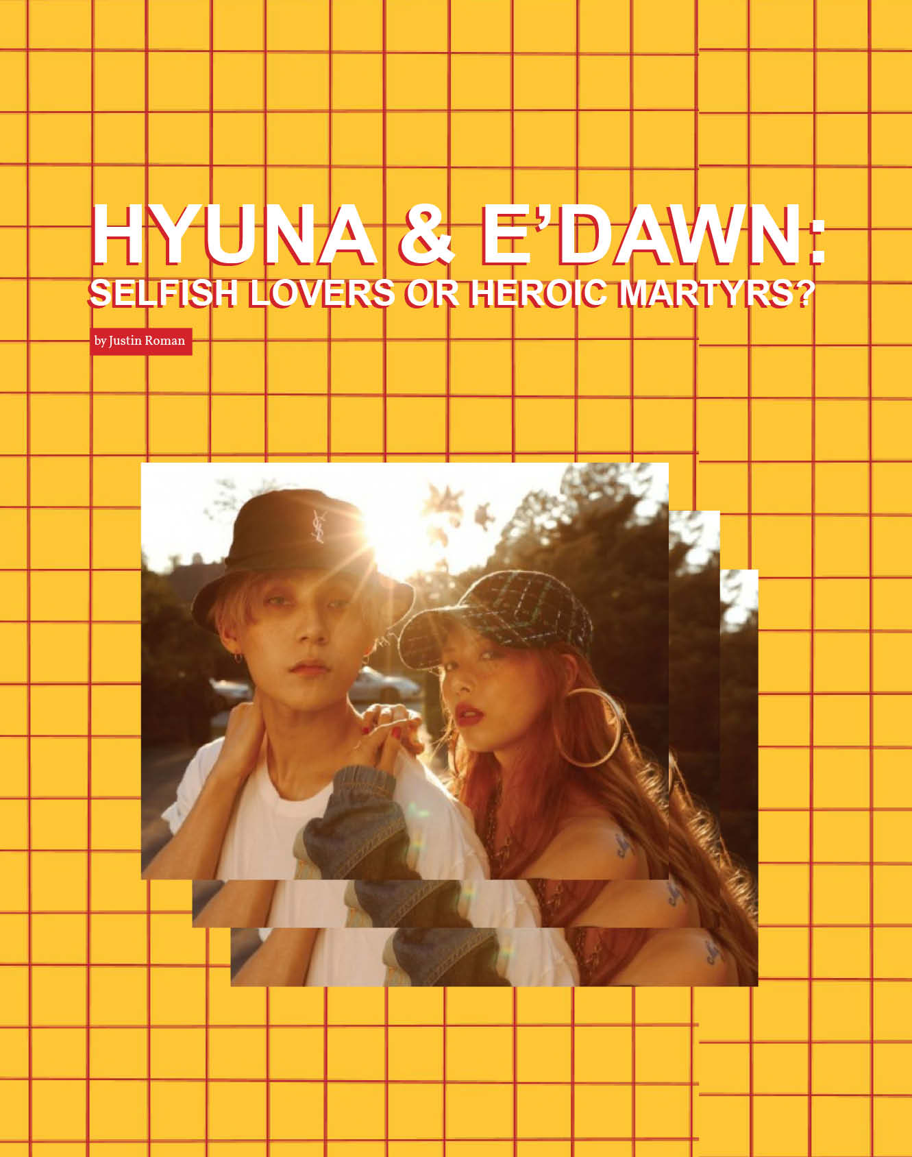

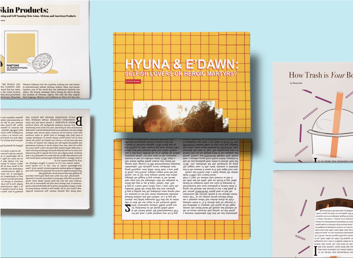
I decided to go with a more playful approach for this spread as it highlighted a scandal in the KPop industry. The red and yellow grid should catch the reader's attention as well as the flashy photo of the scandelous couple. This is what I consider a modern layout. The fonts used here were Arial and Vollkorn.
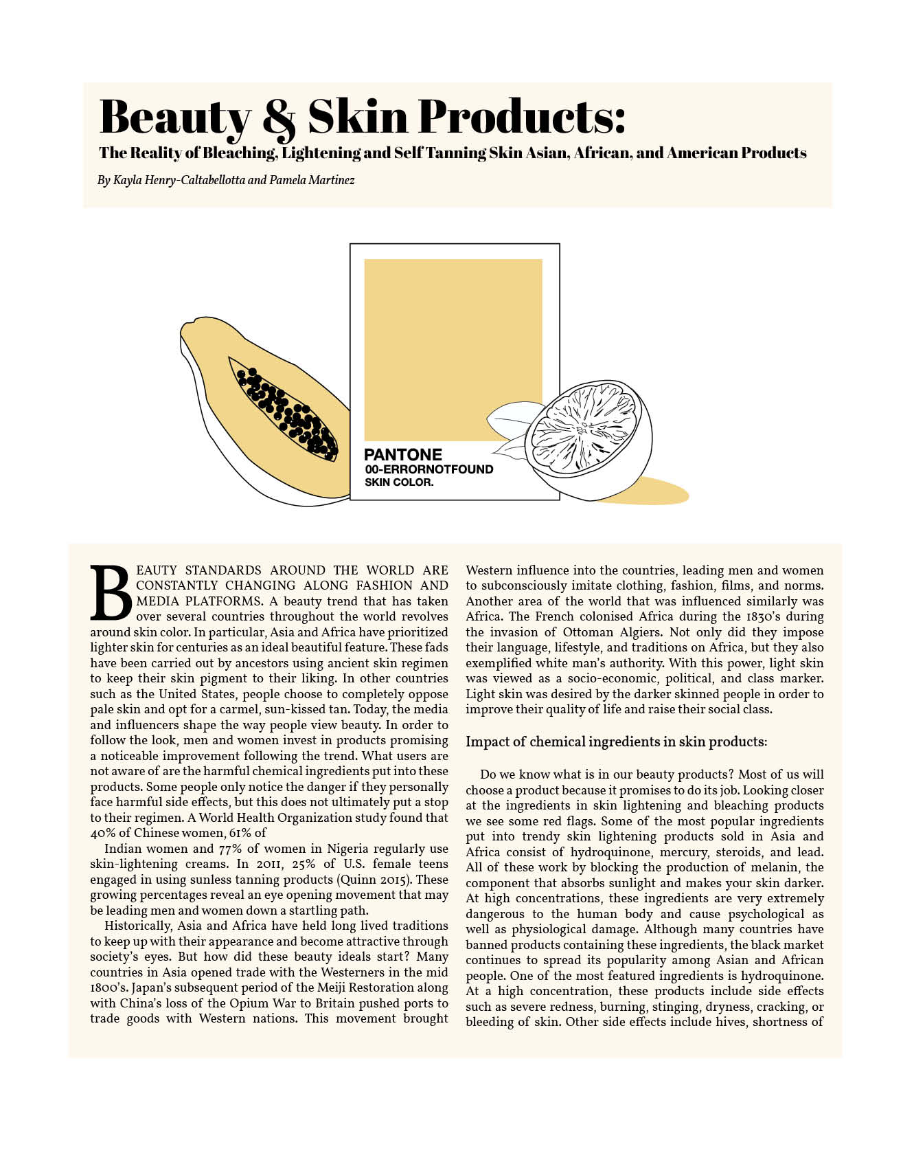
This article had a 'Buyers Beware' purpose. I created this spread using Illustrator and InDesign. I wanted to keep a sleek and visually appealing feel so I stuck with the main color of orange and drew the image contained the papaya, Pantone color match and the orange, all things that were mentioned in the article. I also played around with one of the quotes, as you can see in the drop text. The fonts used here were Abril Fatface and Vollkorn.
Close ProjectAs an intern for this agency, I was able to create logos, advertisements and also vector images for clubs chartered by the Student Association at Binghamton Univeristy. Please follow them on Instagram !
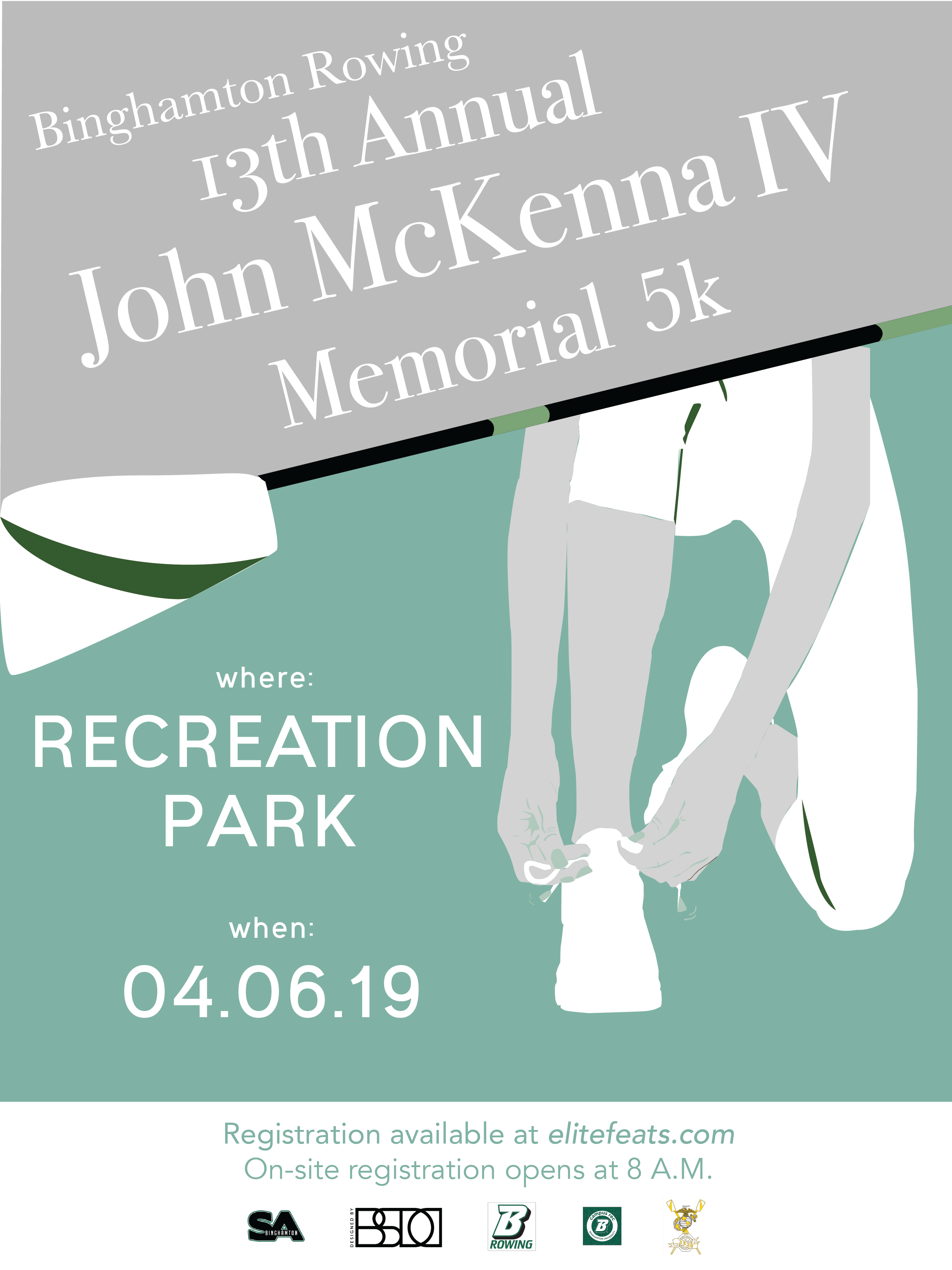
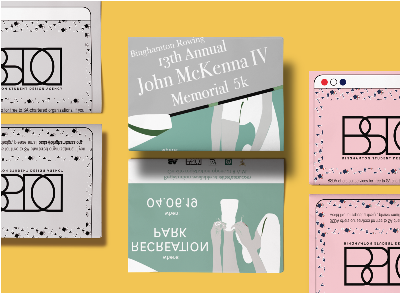
This poster was made to make others aware of the annual race in memoriam of a member of the Binghamton Crew Team. Sticking to Binghamton's color of green and adding a splash of white, I was able to create this poster that would be posted around campus.

I decided to construct the advertisement to look as if it is a shoutout on a website with a design theme. Hence, I used Illustrator to create the vector images of typical design tools. This would become the primary background of the website. This was a draft for a BSDA advertisment to be placed in Binghamton University's newspaper, Pipe Dream.
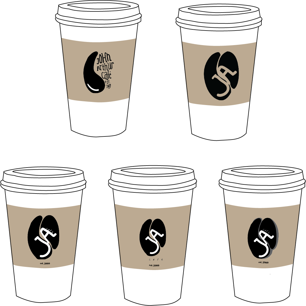
The John Arthur Cafe requested a new logo to stamp on their coffee cup holders. The first design was made to resemble a coffee bean and the logos thereafter were other iterations using the initials of John Arthur Cafe.
Close Project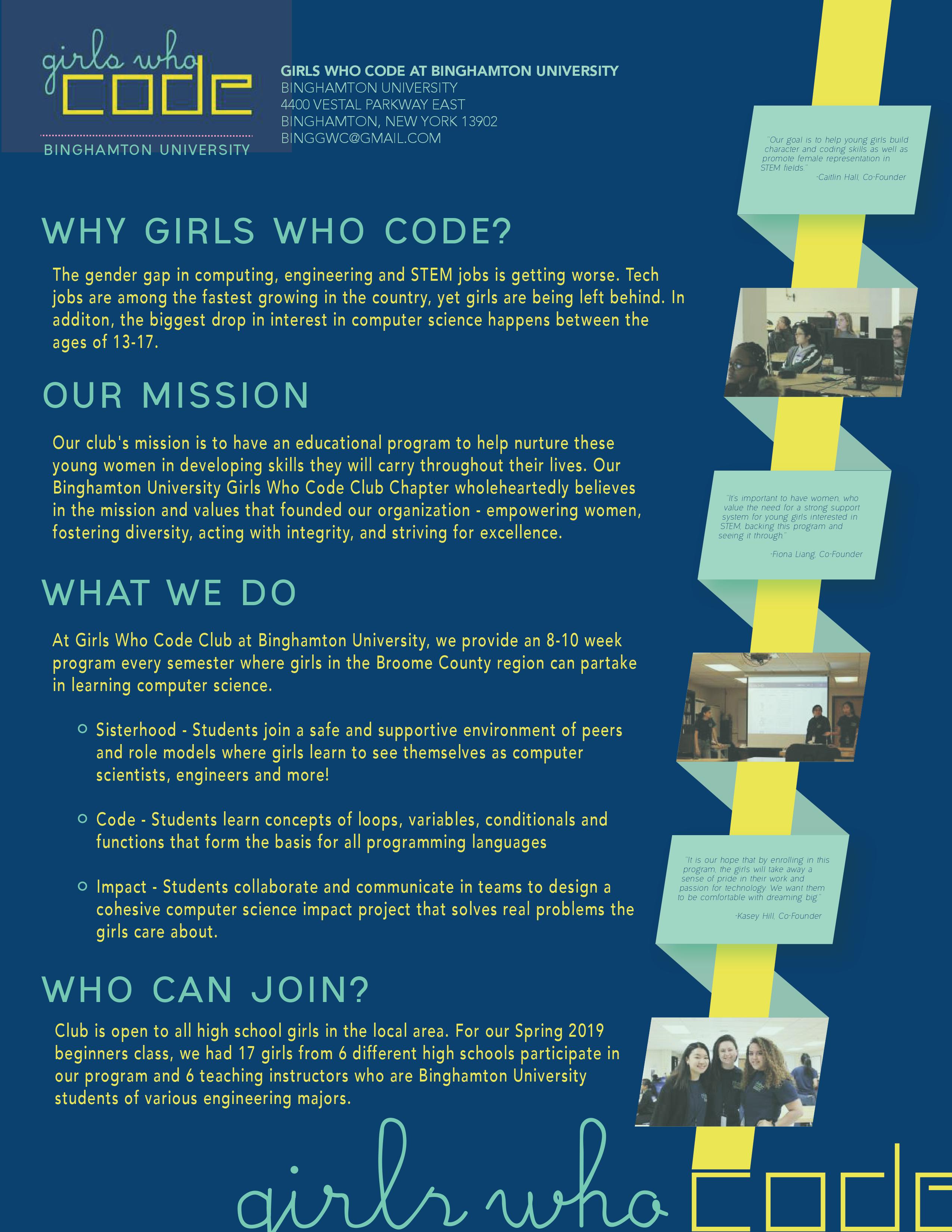
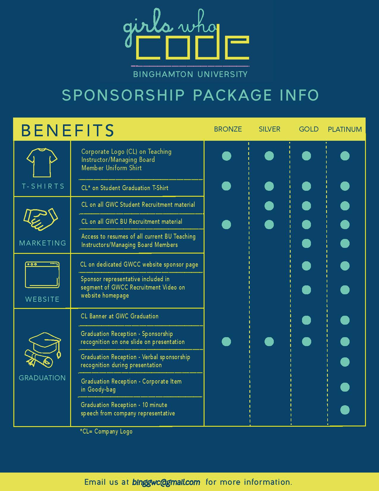

For the cover of this sponsorship package, I wanted to utilize the key colors of Girls Who Code. After integrating a certain style, I had fun using a ribbon approach to include photos on the page. On the second page, I maintained the theme and included vector images drawn on Illustrator. These two designs were both created in Illustrator. Prices were omitted, but if you would like to contribute to our cause, please spread the word about Girls Who Code! Here is our website.
Close Project
As co-layout editor of The Phoenix of 2017, I created a magazine of 156 glossy pages. This contained specially selected pieces from the talented students of Townsend Harris High School, ranging from fictional pieces, poems, photographs, collages and artwork. This won a magazine crown from the Columbia Scholastic Press Association. Take a look at the full magazine here!
Close Project